I research use of instructions in my PhD – so, if you used this guide, I would be happy to hear how you used it! Read it begin-to-end? Tried the most interesting parts? Just reading first and then in practice? Followed it with your own logo design? Drop me a line: d_jan AT ymail.com (Ymail, not Gmail!) or a pm on mastodon
If you have a software or web platform, you need a logo, since this is what you…
- Use as icon on desktops or on smartphones
- As mini icon (“favicon”) in browser tabs
- As symbol for your project in your website’s header
This is what this guide shall help you with.
It is not a guide to branding or a “corporate identity” overall. Neither can it tell you how to create a great logo. Most people who work on software are experts in writing code, and total beginners in creating logos, so this guide shall help to avoid problems of total beginners and give some insights in how you can work on logos. I do this by sharing my work process.
I will show the process in an example project: A collaborative map editor. It does not refer to any real-world project, though there might be similar ones.
Let’s start with an example of what to avoid
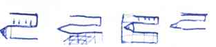
Many people seem attempt to add as much as symbolic elements as possible. If there is a collaborative map editor, there should be maps, collaboration, editing, ideally that the project runs online and is open source.
- A map as background
- some gridlines to make it even more map-like
- a position indicator as a symbol for computer based navigation
- signify the collaborative aspect by icon-like people with stretched-out hands framing the map.
This might look like this:
![]()
Now, does this logo work? There are some tricks to check this. The easiest ist to view it at a small size; some people also blur it or view it from a distance. All these tricks have in common that they check if the logo is succinct enough to still work under difficult conditions; that it uses the space efficiently to be recognizable.
![]()
And it does not work very well, even on a still rather large size. It looks vaguely like an abstract painting in some strange frame.
The blur test is similar:

The position indicator is barely recognizable, the grid lines are gone.
The process and results so far demonstrate two common problems in logo design for beginners:
- Designing the logo screen-size
- Trying to tell everything about the project in the logo by a collection of combined symbols.
The solutions are
- to check again and again for how the logo looks at small sizes.
- to let go of the idea that a logo should tell everything that that project is or aims to be. It might create a logo that is great to talk about but it creates a terrible logo to look at.
A worked example of a logo design process
Many iconic logos, like the nike swoosh or the McDonald’s arcs do not resemble the company’s product. Looking at logos by well known brands is a good start to get a feel for logo designs. Even if you do not like the corporations behind the logos: Big brands are able to hire experienced designers who know their craft.
For logos related to maps, I would look at some established products or projects: Google Maps, here, OpenStreetMap…. I usually draw a small replica to get a feel of it.
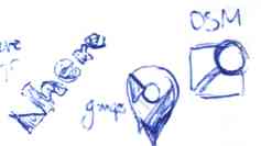
You see that these three already use rather few elements: Here has a “word-mark”, a logo being mainly their brand name with that small triangle; Google Maps has the position marker with some colored segments inside, OpenStreetMap has a map with a magnifier glass overlaid. Pretty simple.
So I start with some exploration, still just drawing by hand, since this is quick and I easily get a history of my ideas since on paper, adding new things is much easier than changing old ones.
I would not aim for a purely abstract logo like the Nike swoosh or McDonald’s arches. Such a logo is difficult to pull off as a beginner. I rather take visual elements that are relevant to the project, but instead of telling all about the project, I try to get across a succinct visual impression.
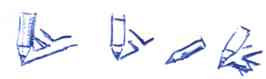
I start with drawing a position marker to see what I can do with it. They are quickly drawn with a pen, no special tool involved. Reading this blog post section takes not much less time than me drawing these.

Combining it with a pencil?

Looks terrible. More ideas…
The pencil is good, though, since we deal with an editor and pencils are a common symbol for editing anyway and plausible for drawing maps as well. Maybe I go in the direction of the open streetmap logo?

Not bad. Maybe a bit too similar. The pencil has a simple shape, this is good for further explorations.
Isometric versions instead of a flattened perspective?
Hmm, just putting a flat representation on a surface does not work (but see the old BeOS icons for great isometric style icons! Just like with code and code architecture, you can learn a lot from studying good examples.)
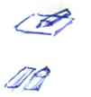
Maybe more drawing utensils?

Not bad, but not map like at all. Some more explorations:
flat-isometric style,
having a dog-eared corner…
drawing utensils, but now combined with map-like elements? Not bad, but still too few map.

That seems interesting, it combines the recognizability of the pencil with the clearly flat surface, so that the pen seems to draw.
I think, I tried enough to give it a try in a software like Inkscape or Penpot. I won’t explain the software here, there are many other guides on that. If you are not at least somewhat familiar with the design software, the ways you can design your logo are severely limited and developing ideas and trying different styles will be hard.
I first try a OpenStreetMap-Logo-like variant:

And then some variants of the semi-isometric ones:

Developing these more:

However, this direction looks like a bunch of traffic signs. Also it is not that easy to see the pencil’s wooden tip, it easily gets lost in the background.
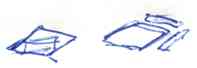
Trying out some other directions with…
![]()
A ruler or…
![]()
…a text marker that might draw a street or a river on the map?
They are not bad, but I have no good ideas for developing these, so I abandon them for now and go back the early isometric ones.
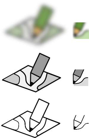
I had these sketches:
So I draw this first:
![]()
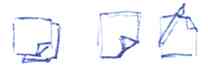
I create some small iterations:
![]()
- I adjust thickness of the line;
- I first add some elements that make the map more map-like (green areas and a street);
- I found the content to cluttered and removed the street and just kept one line, that the pencil draws. But I add a shadow below the pencil there, getting in more depth.
![]()
There are some inaccuracies that are visible when zoomed in; I clean those up. There are is also a problem that is less obvious: The perspective is skewed. I correct this. I also change the color of the pencil a bit and change the drawn line to not start off-map.
![]()
Now, the style is still half-hearted: Some of the look is flat, some is outlined. Lets go all-in and produce two version: non-outlined and outlined-style
![]()
The self-set requirement leads to some changes: The variant without outlines gets more depth by adding differently shaded areas to the pencil. The variant with outlines looses the shadow and the shaded areas and gains the outline around and inside the pencil. So… I think the second one has more character. Its subjective though, but I like the toy-ish look.
![]()
Putting the pen lower avoids it sticking out a lot. This needs less space. I created a second green map element and changes the drawn line to a more dynamic shape.
I am pretty fine with this, I think this could be used for the website’s header.
Now, to the test: Can I put it in 16x16 px of a website tab?
![]()
The version above is 64x64 to spare you getting really really close to your screen. It does not work even at this size. But only a few logos work by just shrinking them. High resolution screens will only help you to avoid jagged edges, but you can’t cram in more details, the space is just too small.
We need a separate version. So I start with a crop, taking the section that seems most expressive.
![]()
This is not a simple fix, though, there are too many lines for too little expression, particularly, there is nothing map-like.
I redraw the elements with a focus on using the space efficiently while still leaving enough space between the elements to not have them blur into each other when reduced to a tiny icon
![]()
This is a notable improvement; gone are the several cluttering elements. However, in the 16x16 version it is easily visible that the outline of the green area and the pencil-drawn line are so close that there is a pixel of space between – and not even that due to anti-aliasing at one point.
![]()
I try with a straight line (easier to control distance) that is a bit lighter (hope to reduce dark areas in anti-aliasing). This solves the problem of the lines being to close.
I experiment a bit and try if I can use the pen and line drawn together with the edge of a paper map.
![]()
I am not happy with that version though, it looses any indication of a map and could rather be about technical drawing in general. However, it gives me the idea to reduce the additional element next to the line drawn altogether:
![]()
This had the intended effect: There is a map-like element and I reduced yet another element to gain more focus. However, history repeats itself here: Now the pencil-outline and the line drawn are too close and smush into each other. At the right side, the distance is okay, but close to the tip I need them to have more distance. This means I need to adjust the curvature of the line:
![]()
That has the intended effect. I also played a bit with the line/fill combination of the green element, now the line overshoots the fill a bit, in hope that this gives a higher contrast.
I think this mini-logo is appropriate, now. However, before I commit to both of them, lets run a few tests:
By deliberately making the logos harder to recognize, we can check if they are distinct enough to still work. I am happy with the results so far, particulary with the black and white version – it seems to work well without color. this used to be essential in times when black and white prints or photocopies were the most frequent way of distribution, but it is still useful today since color differences are harder to see than differences of lightness.
The “Method”
There is no universal process to follow, what drove the process was seeing problems and trying different ways to deal with them. The ability to see these problems and find different ways is what gets easier with more experience.
If you want, you could structure the process retrospectively as:
- Collect logos of similar projects
- Sketching different ideas and elements on paper
- Create some logo ideas in your design app
- Iterate on the most promising ideas; Always check if the design works on smaller sizes, not only full-screen
The resulting logos were have only a few elements – I combined map and pencil, but not more. They are succinct and do not depend on being shown at large sizes. They would work in black and white (though I did not optimize them for it).
There is no “clever” twist, hidden elements or a cool story to write a blog post about. Just an okay logo, but that is pretty much what I wanted to show.
Notes
- As written above – if you used this guide, I would be happy to hear how you used it! Drop me a line: d_jan AT ymail.com (Ymail, not Gmail!) or a pm on mastodon
- Vital Tips for Logo Design, Smashing Magazine, 2009
- Related article: Logo Competitions in Open Source Software Projects
- I would like to add a book on logo design, but I have never read one. I guess, most of what I know is taking classes, design exercises from “Visuelles Gestalten mit dem Computer” and reading books about (micro) typography (like logos, letters need to do a lot in a limited space).
- 2023-09-05: Maybe the whole logo/icon design is too elaborate—and you want to go with something more simple, lets say: A letter or two in a rectangle. You would be in good company: A lot of software does do that. It is a bit dull, but that did not stop Adobe to do it for all of their products. Microsoft does it too, for office (though a bit more fancy), LinkedIn and ycombinator also come to mind. If you do that, keep a few things in mind:
- Contrast matters. Choose a background with a strong and/or dark color for white letters or a light and pastel color for black letters.
- Choose a font without much flourish; small details won't be visible at 16×16px.
- The letter(s) should be placed at the center. However, what center according to measurements might not be what looks like the center, and the looks are what matters here.
- All lines of the letters (“strokes”) as well as the distance between the lines should be at least a pixel wide, otherwise you end up with some mush. With a pixel based editor this is easy to see directly, if you use a vector-based editor like Inkscape, Illustrator or Affinity Designer, use the pixel preview or icon preview function.